How to craft simple emails
Instead of tweaking design elements, what if you could focus on writing content and stop worrying about email design entirely?

Email marketing shouldn’t feel like a chore.
But for many people, it ends up that way. The endless tweaking of fonts, images, and colors drains your energy before you even start writing. Let alone hitting the send button.
What if you could stop worrying about design entirely?
Most of us don’t have the time to experiment with email editors. The more time spent on getting the look just right, the less time is spent crafting the content that actually matters to your audience.
The cost of complexity
Many email platforms promise creative freedom but often trap users in an endless cycle of design adjustments. For creators and small businesses, time is a precious resource. Spending hours figuring out how to make a button look perfect is inefficient.
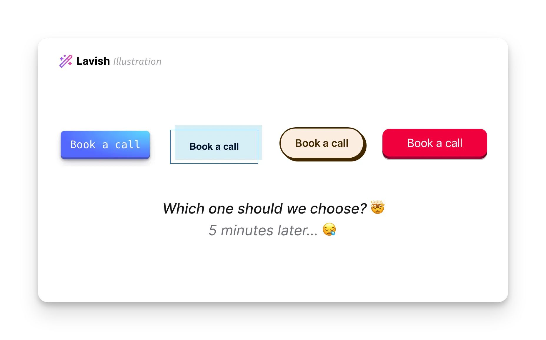
Email marketing is supposed to connect you with your audience. When the tools become a barrier, the content is often lost in the process. However, it’s possible to reset and simplify the approach.
The true value: Content over design
The most effective emails are the ones that deliver clear and compelling content. A study by Campaign Monitor has shown that simple-text emails can have higher open rates and engagement levels.
Simple-text emails outperform HTML as much as nine times better when it comes to engagement. — Eric Qunstrom from CIENCE Technologies
Think about the emails you open and read yourself. They’re often personal, direct, and focused on delivering values. And I don’t mean a completely plain-text email. Instead, a just enough design to amplify the value of your content.
Let me show you how to make such emails.
The antidote: Simple emails
There are many ways to create simple emails. You can write some code or tweak some templates, but let’s use Lavish here because it’s easy to get started. Let’s write a simple email for a product update.
Right after signing up, click the Create Campaign button to start writing. Here is what you’ll see.
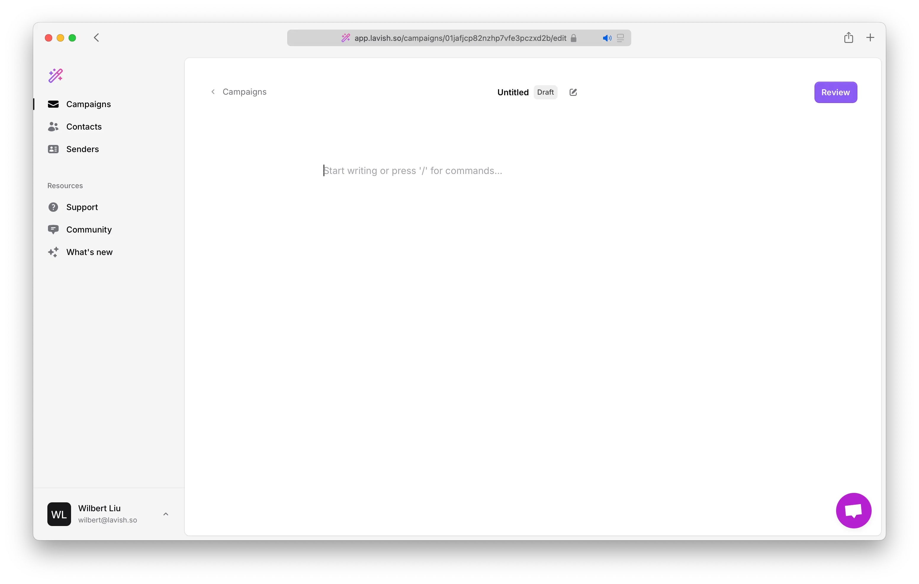
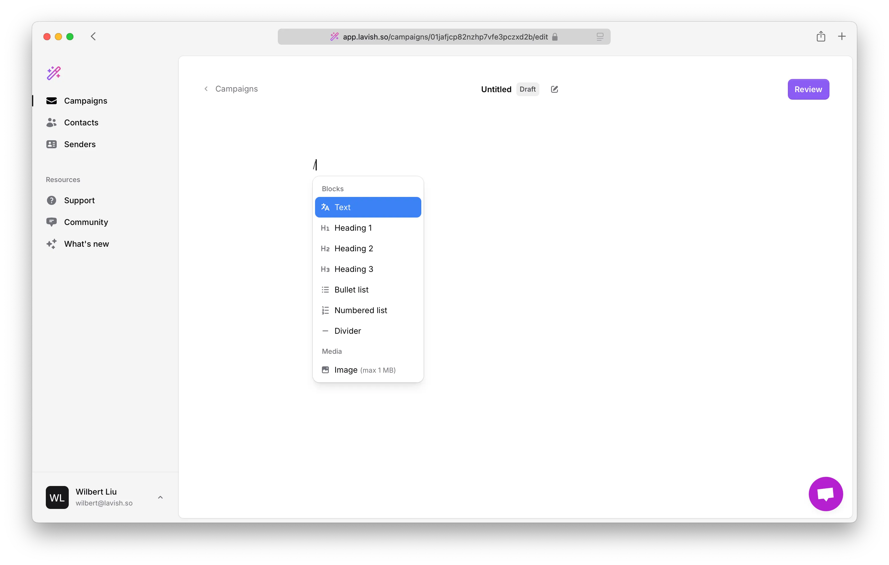
If you have used Notion, you should feel at home. You can write some Markdown like heading 1, 2, and so on. If you get lost, the slash command comes to the rescue. Simply press / to see what’s possible.
Curious to try it yourself? You can sign up and start exploring.
Now, let’s get back to our product update email. I’ve written it, and here is a simple yet beautiful email that is ready to send.
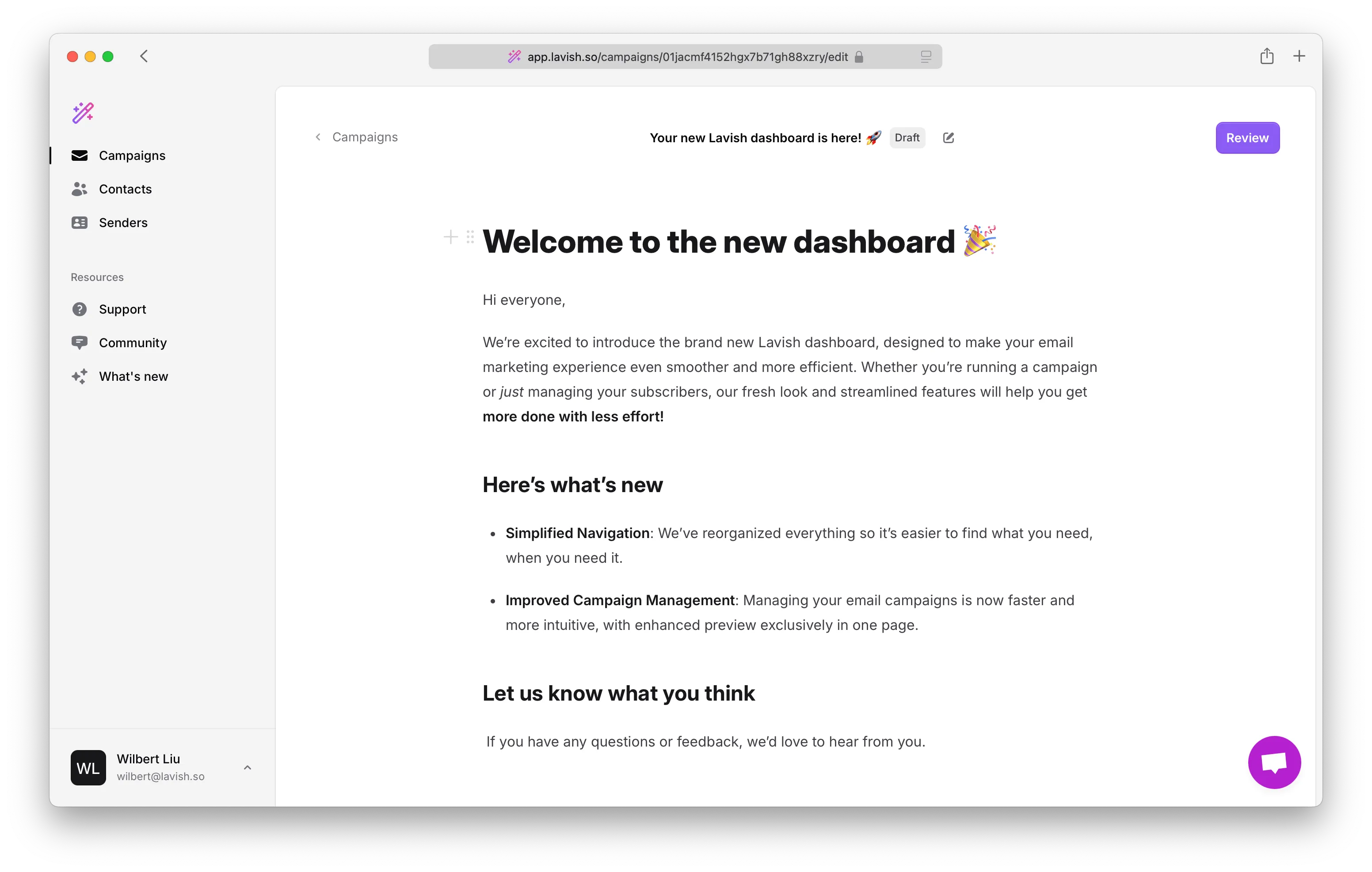
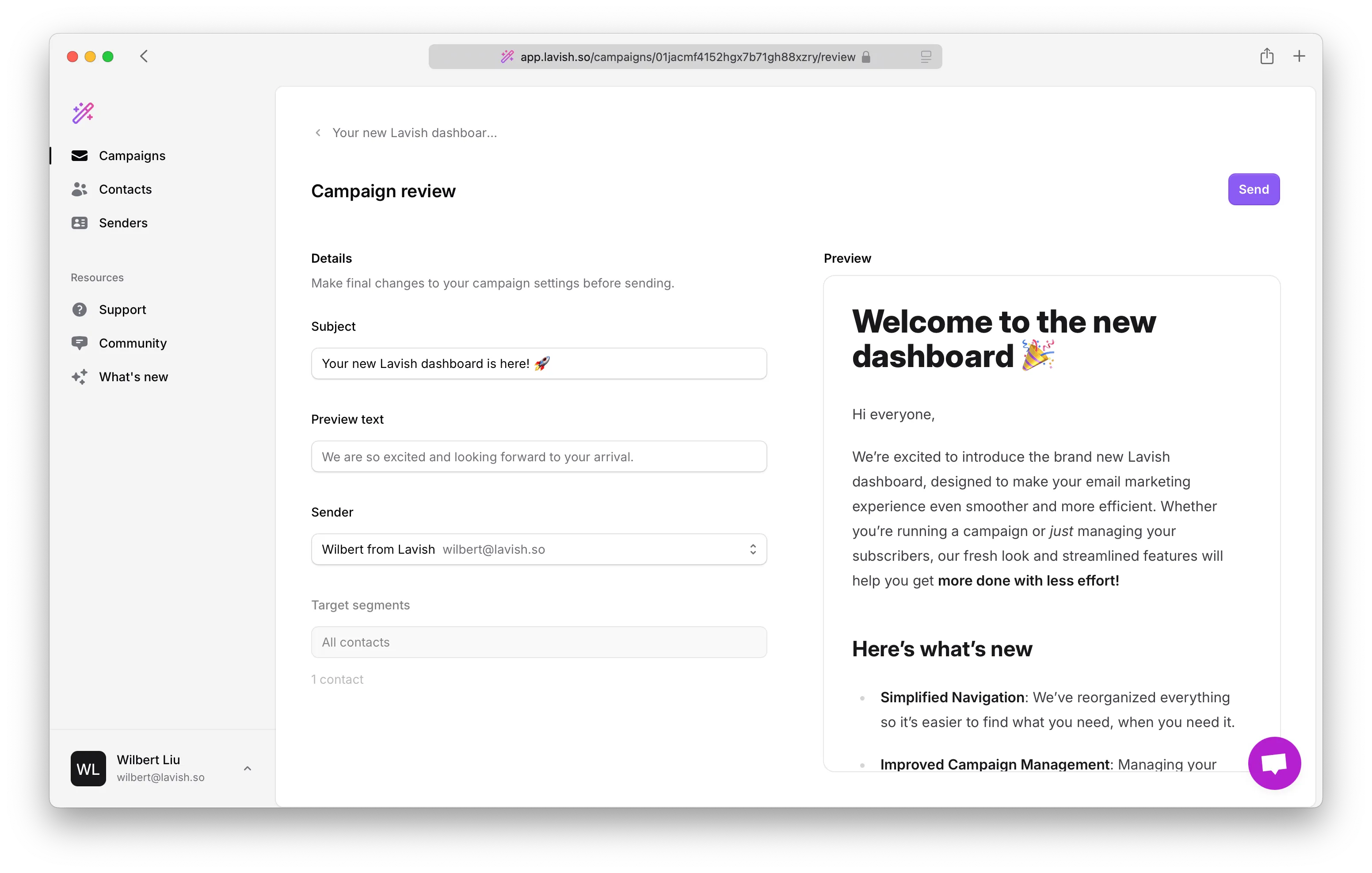
When you are ready to send the email, click the Review button to give it a final touch. You’ll be directed to the Campaign Review Page, where you can change the subject, add preview text, and more. Whenever you feel ready, click the Send button.
Voilà!
We were able to hit the send button in a few minutes. And the best thing? My coffee is still there as I’m ready to move on to the next task. ;)
Conclusion
Simplicity is the key to effective email marketing. Instead of spending hours trying to perfect the design, focus on what really matters: the content.
Now, here is the deal. If you’re ready to simplify your email marketing, get started with Lavish for free today. And if you need help migrating, let us know. We are happy to help.
And try it yourself.
Start creating simple emails today and see the difference.